Challenges of minimum target size for mobile devices
WCAG 2.2 asks for interactive targets of at least 24 by 24 CSS pixels. That sounds clear on paper and with a mouse pointer it usually is. But on a touch screen, you aim with your finger, not a cursor. So the real question becomes: how big is 24 pixels when you have to hit it with your finger?
We have an older article relating to target size as well: You can touch this! Zijn de target sizes in jouw UI wel groot genoeg? (Dutch only). That was written as part of a series on WCAG 2.2 prior to its official release.
What does the WCAG have to say?
WCAG 2.2 Success criterion 2.5.8 Target Size (Minimum), level AA, covers pointer input, meaning both mouse and touch. For the purpose of this article, we are focusing on the consequences for touch.
The rule is that the active target area of a link, button or control should be at least 24 by 24 CSS pixels.
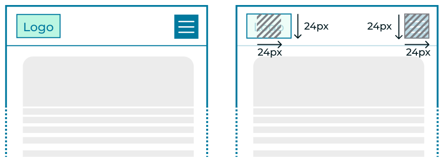
But there are exceptions:
- Spacing: a target smaller than 24 by 24 pixels can still pass if you can trace a circle around it with a 24 pixel diameter that doesn’t intersect another target circle. We’ll come back to this one.
- Inline: the target sits in a sentence, like a link in a paragraph.
- Equivalent: another control on the same page performs the same function and does meet the size requirement. The presence and location of that alternative should be obvious.
- User agent control: the browser sets the size and you didn’t change it, like the tiny arrows of a default number field. Those often have an alternative as well: e.g. users can type the number or use the arrow keys.
- Essential: a particular presentation is essential or legally required.
Making targets big enough
Even if the visual size needs to be smaller, you can still make the active target bigger. Let’s look at a few examples:
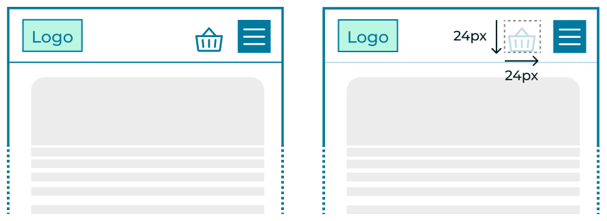
Icon buttons: make the active area 24 by 24 pixels, combined with a transparent background. Even if the icon itself is smaller, the touch area is sized correctly (using padding or a pseudo-element in CSS).
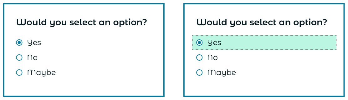
Checkboxes and radio buttons: the label is wrapped around the input, so tapping the label works too. The label’s line height and padding then set the size of the target.
The same logic applies to other possible elements such as:
- Menu items (eg. dropdown list)
- Buttons with text
- Select fields (including comboboxes)
- Text input fields
A CSS pixel is not a fixed size
Here’s where touch gets tricky. A CSS pixel has no fixed physical size. Modern screens pack 4, 9 or more physical pixels into every CSS pixel, and the ratio differs per device. The physical size of 24 CSS pixels depends on 4 things:
- the screen resolution: how many pixels across and down,
- the pixel density: how many pixels fit in an inch,
- the physical size of the screen,
- the scaling
So how much does it vary? We measured 24 CSS pixels on several devices and calculated pixel size for the newest iPhone and iPad mini:
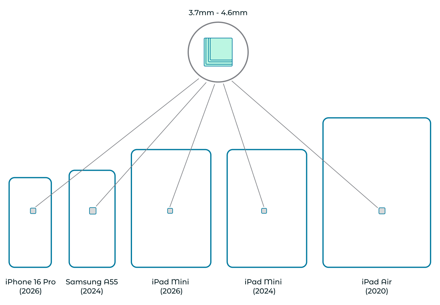
The squares are not drawn in real relation to the device sizes. They do show the relative size difference to each other. They are much smaller when seen on screen in person.
| Device | Screen | Resolution | Density | Viewport (CSS px) | 24px |
|---|---|---|---|---|---|
| iPad Air (2020) | 10.9” | 1640 × 2360 | 264 ppi | 820 × 1180 | 4.6 mm |
| Samsung Galaxy A55 (2024) | 6.6” | 1080 × 2340 | 390 ppi | 378 × 819 | 4.4 mm |
| iPhone 16 Pro (2024) | 6.3” | 1206 × 2622 | 460 ppi | 402 × 874 | 4.0 mm |
| iPad mini (2024) | 8.3” | 2266 × 1488 | 326 ppi | 744 × 1133 | 3.7 mm |
| iPad mini (2026) | 8.5” | 2316 × 1512 | 326 ppi | 756 × 1158 | 3.7 mm |
The size variation is small: around 4 mm seems to be realistic. That makes sense as manufacturers have to balance sharpness, scaling and viewing distance, or interfaces would become unusable. Still, there is a trend: the newer and sharper the screen, the smaller the CSS pixel. That is a bit surprising, as similar devices can be expected to be used at a similar viewing (and touching) distance. It could be interesting to measure this on older phones with screens closer to 5 inches and lower densities. I suspect those give you noticeably bigger targets.
Side note: the user’s own settings play a part too, of course. Settings like Screen zoom on Samsung phones or Display Zoom on iPhone change how many physical pixels make up one CSS pixel, and, with that, the physical size of every target.
Put your finger on it
Four millimetres is pretty abstract, so compare it with your hand: 4mm is about half the width of your pinky fingernail. Now imagine hitting that with your index finger, on a moving bus, or with a tremor.
That’s why the makers of mobile operating systems ask for bigger sizes:
- iOS: Apple recommends 44 × 44 points as the default control size, and 28 × 28 points as the minimum (Human Interface Guidelines).
- Android: Google recommends at least 48 × 48 dp (Android accessibility guidelines).
Note that they express this in “points” and “density-independent pixels”, rather than CSS pixels. Those are just the native-app versions of the same thing.
WCAG 2.2 has a stricter level too: 2.5.5 Target Size (Enhanced), level AAA, asks for 44 × 44 CSS pixels. That’s the same size as Apple’s recommendation.
When there’s no breathing room: use spacing
Circling back to the first exception: if you can trace a 24px diameter circle around the target area that doesn’t intersect another target circle, the size does not matter anymore.
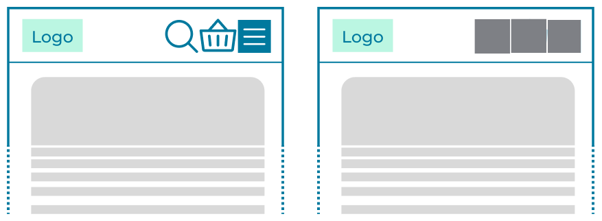
Space on a screen is precious. Big targets don’t always fit right visually. That’s where the spacing exception helps. Here are a few examples in images:
Here, 24px target areas sit right next to each other without overlapping. That is perfect but looks a little cramped because we are still using 24px icons.
Making the target area smaller, gives us a nicer look.
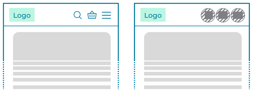
There are two things at play there:
- Visually small: with the focus on avoiding target overlap, we can make the area much smaller. The catch is that users can’t see where one target ends and the next one begins. If the hit areas sit right next to each other, a slightly-off tap triggers the next target.
- Side note: nothing is keeping you from only scaling down the visual content and keeping the target area 24px or more like before. In this use case, you have both options.
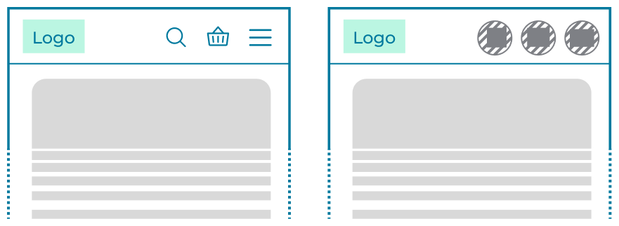
- Real spacing: push the targets apart with margins or positioning. This solves our problem. The gap between them is dead space, so if a finger lands slightly off, it hits nothing instead of the wrong control.
If you can also add a sliver of extra space (eg. 10px), we have our spaced out feel ànd decreased chance of hitting another area.
Our advice
- For groups of targets, think spacing first. Toolbars, pagination and icon rows benefit more from space between targets than from the bare minimum size.
- Go bigger than 24 pixels when you can. 24 is a minimum, not the end goal. Move towards the sizes mobile apps, and aim for WCAG 2.5.5 where the design allows.
- Test it yourself. Open the page on a real device and tap every control.
References
Latest articles
-
Help! I'm getting criticism about my website's accessibility. Now what?
In late August 2026, usability experts said that the website of the Federal Agency of the Debt, where citizens can buy government bonds, is a textbook example of how not to build a website. That criticism wasn't new: three years earlier, the same editorial team had already said the site was outdated. The Agency promised at the time to work on it. Since then, nothing has changed, and there aren't even plans anymore, because the budget is lacking.
-
Bingo! Do you recognize these excuses about accessibility?
"Someone who is blind doesn't need our website anyway, right?" Anyone who has ever worked on a web project has definitely heard this sentence (or a variant of it) before. Usually in a meeting, usually right at the moment accessibility finally made it onto the agenda.

Popular articles
- Help! I'm getting criticism about my website's accessibility. Now what?
- Accessibility Statement Generator
- Tooltips that work for everyone
- Star raters are more challenging to make accessible than you might think
- Fixing digital accessibility issues with the press of a button: too good to be true?
- Combined 50 years of accessibility expertise: an expert interview
How can we help your organisation?
-
Mail your question : info@elevenways.be -
Call us : +32 (0)78 079 111