A more inclusive website thanks to media queries
Did you know that media queries can also make your website more inclusive, in addition to traditional accessibility practices like alt texts and HTML usage?
With CSS media queries we can address settings and preferences of the browser and operating system and then explore them. The most famous media query is the one where you define various viewports (screen sizes) in the CSS and link specific styles to each screen size:
@media screen and (min-width: 600px) {
    .element {
        /* Add your styles here */
    }
}
This is the basis of responsive web design, the now fully established technique whereby websites adapt to the screen with which a visitor views your website. However, you can do much more with media queries. This way, they can help you make your website more accessible. That's what this article is about.
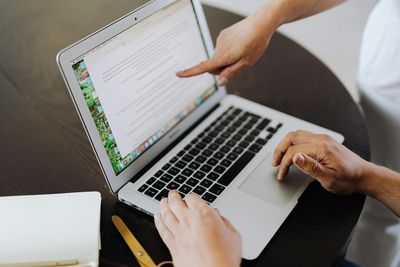
Dark Mode is your friend
Did you know that Dark Mode is one of the most used accessibility features on smartphones and tablets? Many people like not to strain their eyes too much. It is by no means only about people with a visual handicap. As a developer, you may also like this, by using your code editor and browser in a dark theme.
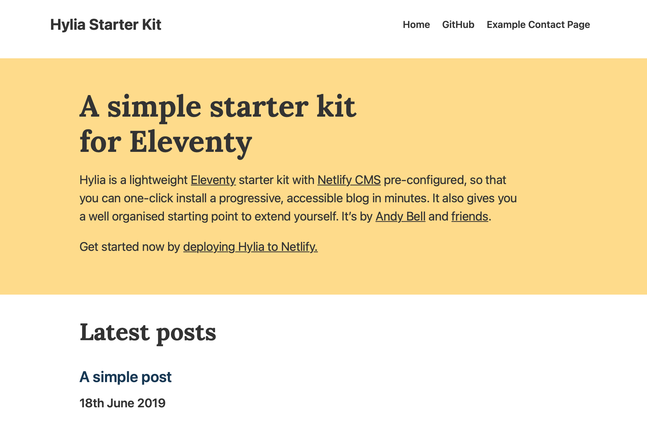
Website in Light Mode
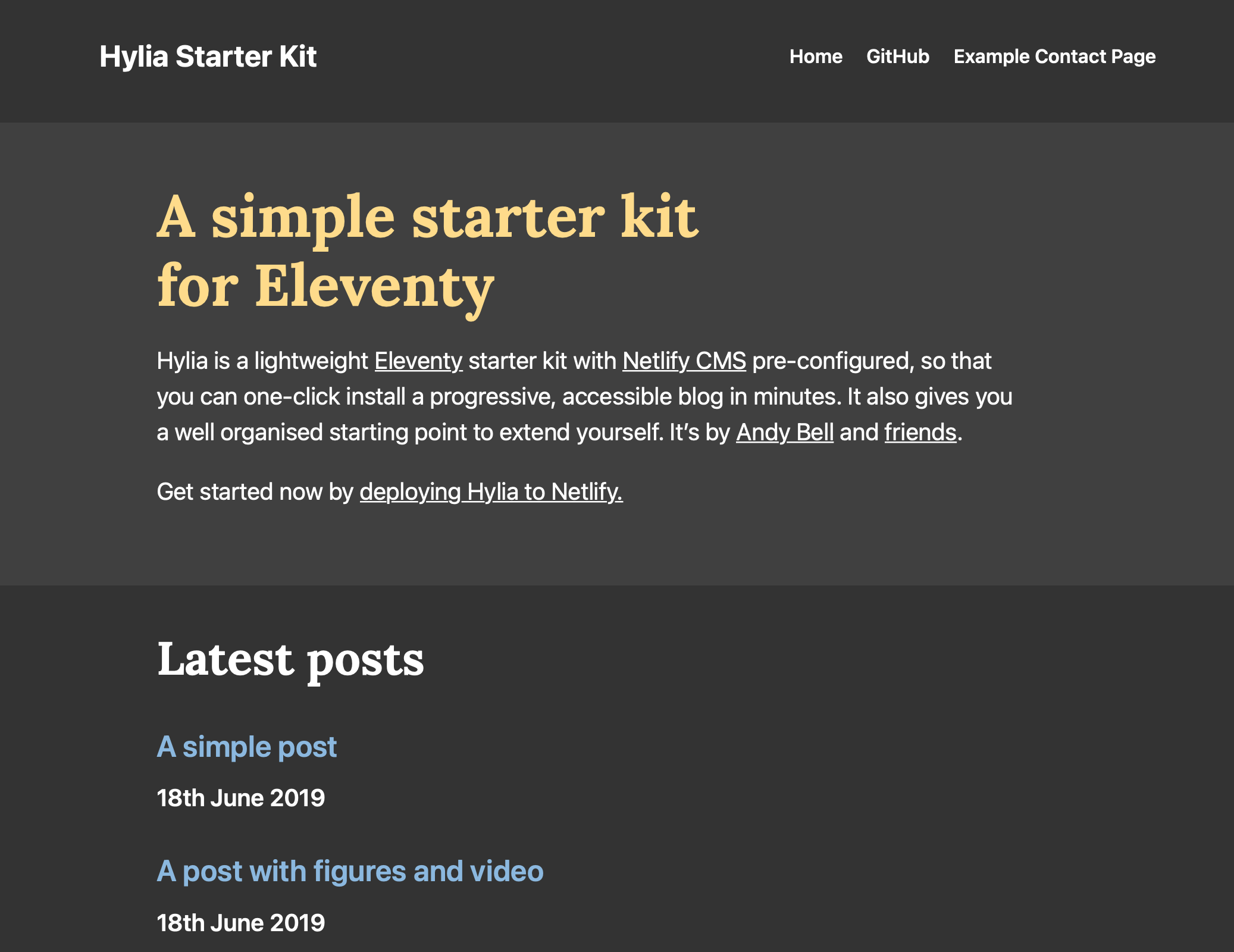
Same website in Dark Mode
You can accommodate this preference with media queries, specifically with prefers-color-scheme:
body {
    background-color: white;
    color: black;
}
@media screen and (prefers-color-scheme: dark) {
    body {
        background-color: black;
        colour: white;
    }
}
This is a very simple example, but in principle it means that you define a separate style for your website in the media query prefers-color-scheme. This way you can support Dark Mode.
Want to know more about developing a Dark Mode version of your website? CSS Tricks has a complete guide.
Not too much movement please
Animations are fun and can really add something to a design. Unfortunately, people with balance disorders or who get dizzy easily cannot always tolerate movements or animations. These users can set on their computer or smartphone that moving things on a page should be reduced. The following example from Polypane browser respects that setting and renders animations and motions switched off:
@media (prefers-reduced-motion: reduce) {
    body *,
    body *::after,
    body *::before {
        animation-delay: -1ms !important;
        animation-duration: 1ms !important;
        animation-iteration-count: 1 !important;
        transition-duration: 1ms !important;
        transition-delay: -1ms !important;
        scroll-behavior: auto !important;
        background-attachment: initial !important;
    }
}
Note: We are specifically talking about moving content and animations here. Changing colors or fading something in and out is no problem.
Let's flip colors!
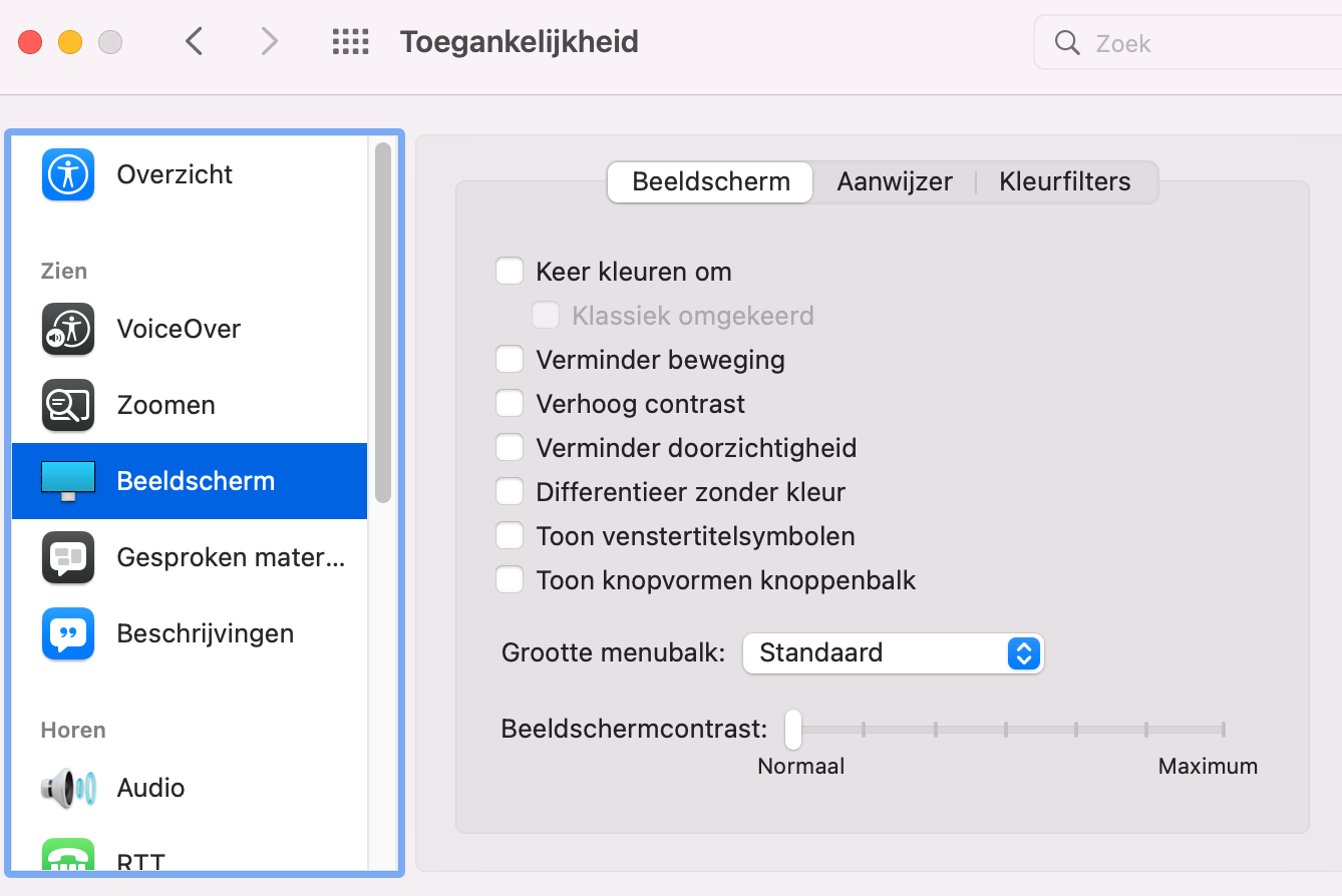
macOS offers the option to invert colors for the system and all applications. (go to system settings — accessibility — display)
This is (for now) only for macOS and Safari users. Windows and other browsers do not yet support it. If this setting is enabled in the macOS accessibility options, you can use this media query to optimize your existing design for it:
p {
    color: gray;
}
@media (inverted-colors: inverted) {
    p {
        background: black;
        colour: yellow;
    }
}
@media (inverted-colors: none) {
    p {
        background: gray;
        colour: red;
    }
}
In the example above, people who have enabled the feature will see blue text on a white background (the inverse of yellow on black as defined in the CSS). If the browser supports the query, but the feature is not enabled, the background is gray and the text is red. A browser that does not support the query will display gray text.
These queries are coming
prefers-reduced-data
When people indicate in their browser settings that they want to limit their data traffic (because they don't have a fast internet connection, for example). Currently, this query is not yet supported by browsers as it is still under development.
This query takes two values:
- no-preference: if no preference is known by the system.
- reduced: Allows the user to have a lightweight version of the page.
Curious how you can put together a lightweight version with this? Polypane has a tutorial!
prefers-contrast
When people in the settings indicate that they want more or less contrast. This query has partial support in Safari, and has been supported since Chromium 96.
This query has four values:
- no-preference: if no preference is known by the system.
- more: if the user has indicated that he wants to use a higher contrast value.
- less: if the user has indicated that they want to use a lower contrast value.
- custom: this matches the query forced-colors if it is also used.
Prefers-reduced-transparency
When people indicate that they do not like to see things on transparent backgrounds. There is currently no support for this in browsers because this feature is still under development.
Forced-colors
For when people have enabled high contrast in their operating system. Currently, Firefox and Chromium-based browsers on Windows have support for this.
This query takes two values:
- none: This mode is not used.
- active: The browser uses the limited color palette. NB! If prefers-color-scheme is also used, the values of that query will be affected by the colors defined here.
It is important to note that this query affects on a number of CSS properties and values.
Note: Unlike the queries for different screen sizes and dark mode, the above queries are not intended to have a separate design for users who have these options enabled. Rather, it is intended to further optimize your existing design for these users if these options are enabled.
Go one step further!
Challenge yourself by using these queries in combination with progressive enhancement. By starting from a simple, stable foundation for everyone and making sure you add features for modern browsers and operating systems, you really take inclusive design a step further.
If you want to go all hard core, you can also use interaction media queries: this allows you to fine-tune the target size of interactive elements to the use of fingers, a stylus such as the Apple Pencil and devices such as the Kinect. Consider, for example, placing buttons slightly larger and further apart for touch devices.
Test it!
If you want to get started with these queries, testing is important. You can test with the browser Polypane, which has a lot of options to test for accessibility and inclusiveness. However, these queries require certain settings to be enabled. We have collected some guides for you:
- Enable Windows High Contrast Mode (Windows 10 and 11)
- Enable Dark Mode on iPhone, iPad and iPod Touch
- Enable Dark Mode on Mac
- Activate Windows Dark Colors
- Enable inverted colors on iPhone and iPad
- Mac: Reduce Screen Shake, Invert Colors, Enable Higher Contrast
- iPhone and iPad: Enable Higher Contrast, Invert Colors, Enable Less Transparency
- Reduce the screen movement of an iPhone, iPad or iPod touch
Conclusion
Media queries are becoming more and more fun and interesting because there are more and more options. Use them and seize the opportunity to make your website more inclusive. Keep an eye on developments in browser support at caniuse.com.
Latest articles
-
Accessibility Statement Generator
An accessibility audit has been completed, and the next question is: “What exactly needs to be included in the accessibility statement?” For specialists who run checks every day, that may feel routine, but drafting a statement is something many people still struggle with.
-
Multi-level navigation: the challenge of identifying parent sections for screen readers
Many guides show you how to build an accessible navigation menu, but they overlook the "you are here" complexity. How do we translate an "active parent" visual highlight into something a screen reader user actually understands?
Popular articles
- Accessibility Statement Generator
- Tooltips that work for everyone
- Star raters are more challenging to make accessible than you might think
- Fixing digital accessibility issues with the press of a button: too good to be true?
- Combined 50 years of accessibility expertise: an expert interview
- More than half of Belgian government websites have no accessibility statement
Feasible accessibility tips in your mailbox
How can we help your organisation?
-
Mail your question : info@elevenways.be -
Call us : +32 (0)78 079 111